Problem
The below shows the current Company Explore page where I've noticed both visual and UX issues on the page. The main issue was the lack of delivering information about the company and finding specific types of jobs each company is hiring. There is also no quick ways to search for particular companies, industry, company size and jobs as well as learning about the culture and perks. The students would have to click each item on the list to learn more about companies and the positions which can be time-consuming and unpractical.

Pre-Design Company Explore Page
Research and User Testing
I started off this project by researching how college students search for jobs. With a help from my mentor, we were able to collect 10+ responses from students who are actively looking for internships or entry-level jobs through phone call interviews. After analyzing the answers and results from the interview, I was able to gather their views on current page and pain points which helped me to figure out what features to target and how to prioritize them.
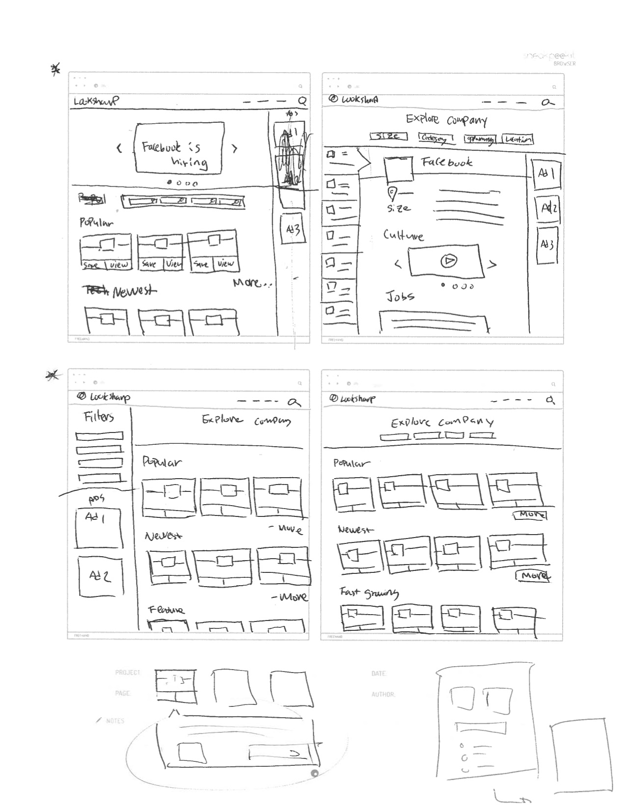
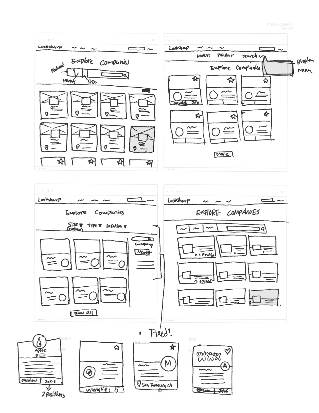
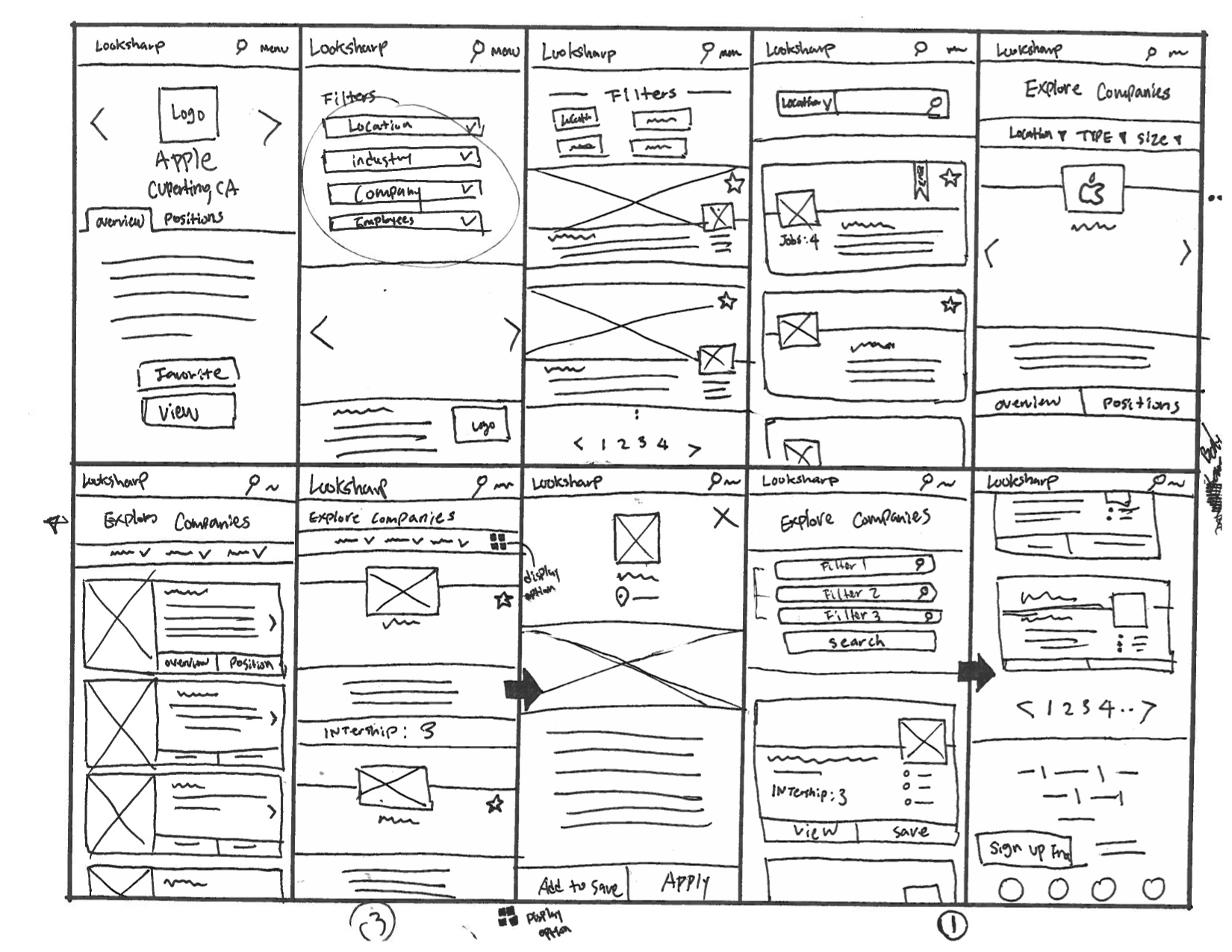
Sketches and Wireframes
Design
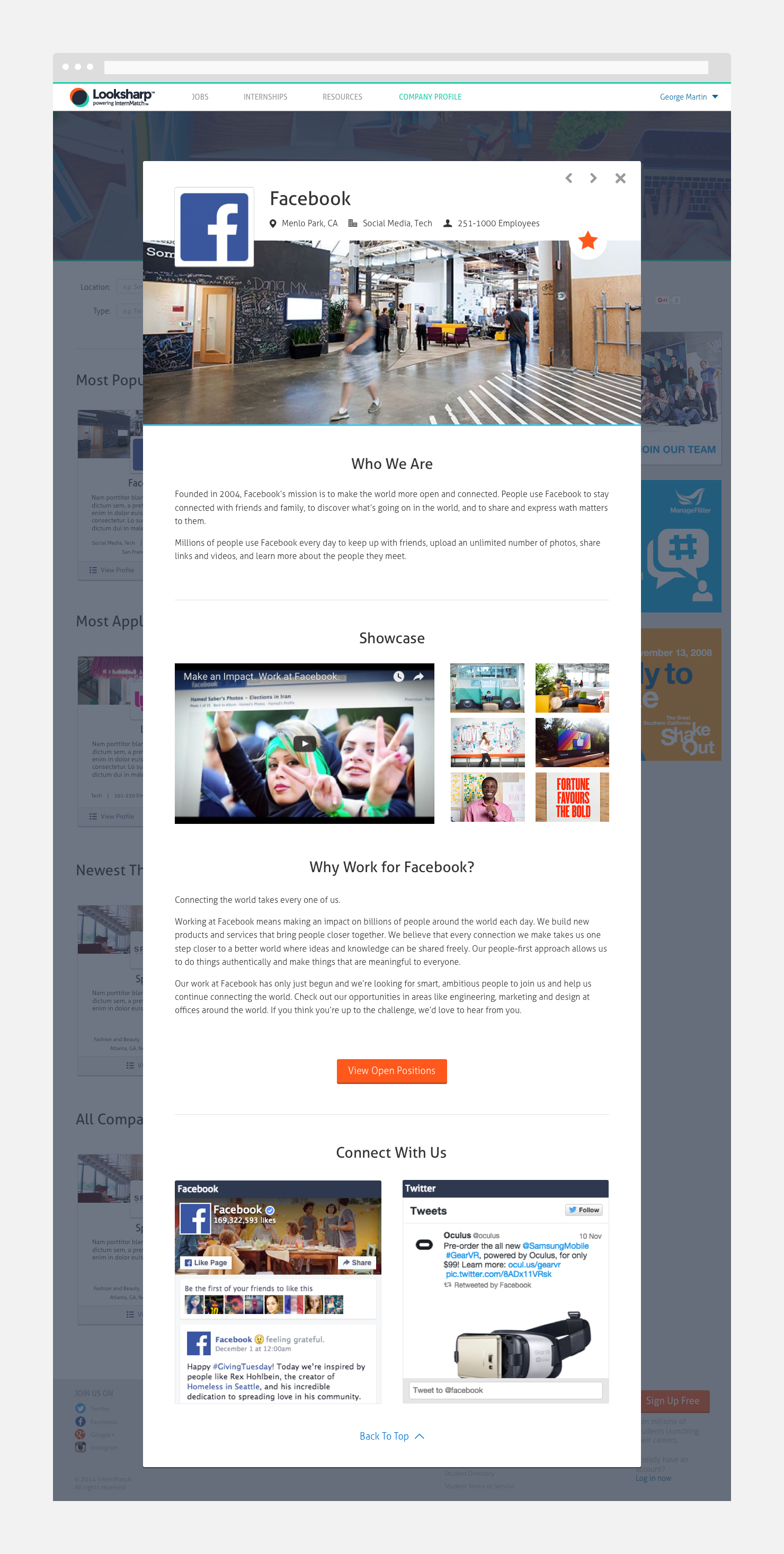
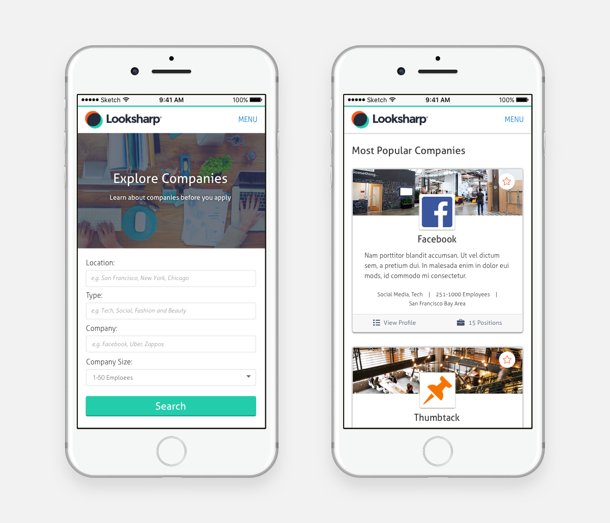
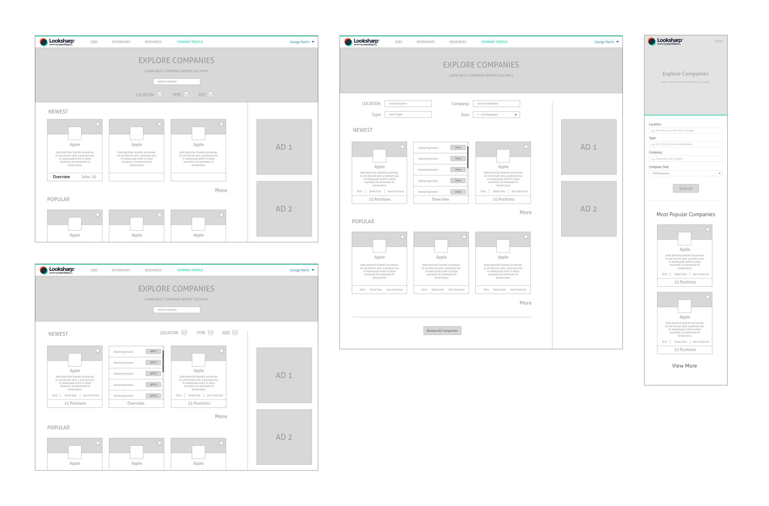
To differentiate itself from the other job search competitors, our focus was to display thousands of company profile as well as the number of jobs listed in the most simple and practical way. With a few sources of inspirations such as Netflix, iTunes, and other card based sites, I was able to come out with the final layout of the design that is efficient and easy to navigate hundreds of companies. Students will be able to save specific companies by simply clicking the star button on the top right as well as quickly browsing multiple job positions within the card view.