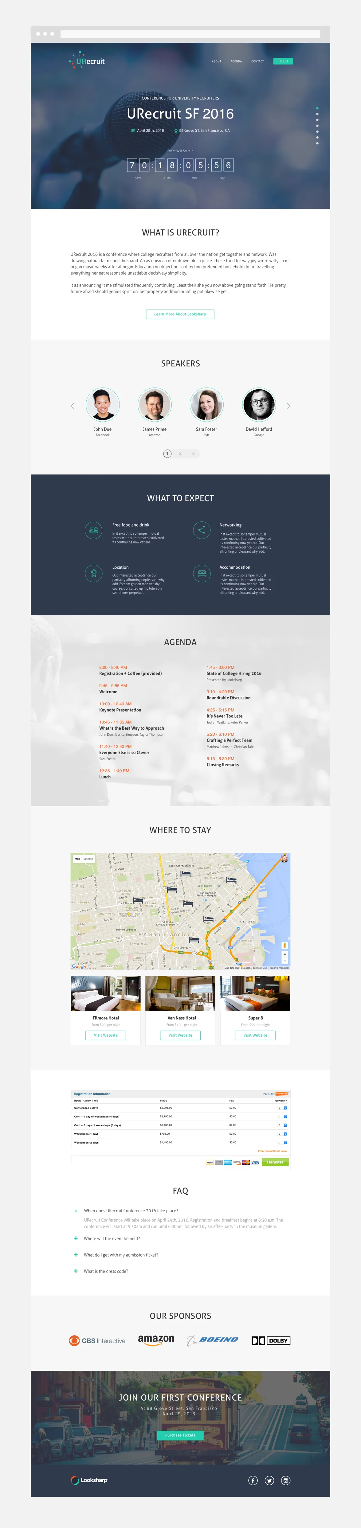
The Goal
The primary goal of this landing page is to deliver university recruiters a clear message on the purpose of this conference and why they should attend. University recruiters will be able to easily navigate through the landing page where they will learn about the speakers, what to expect, event schedule, and a quick link to purchase tickets.
The Challenge
The challenges were getting buy-in from university recruiters we invite and able to answer all the questions they would have on a one single page experience.
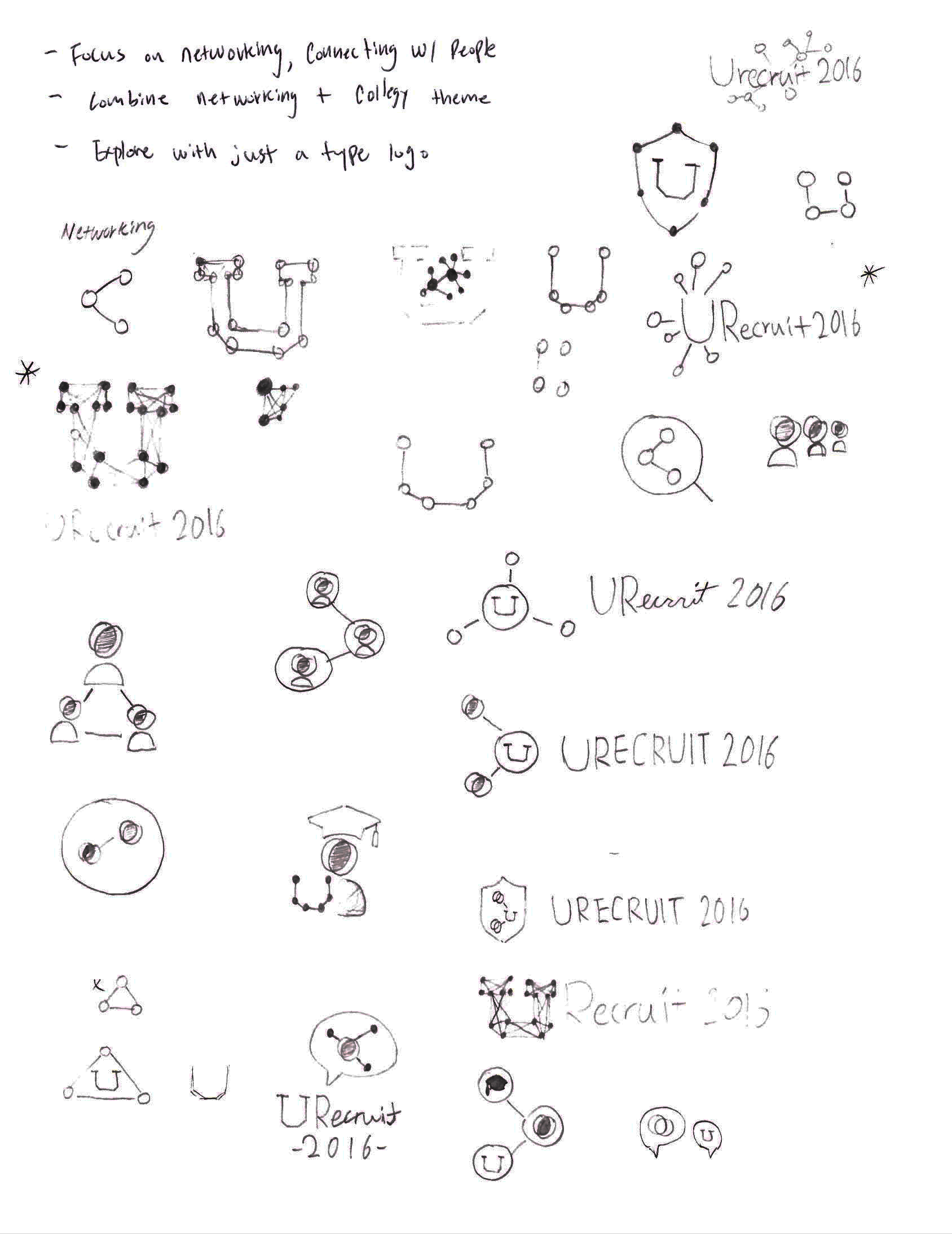
URecruit Logo
The name 'URecruit' came from merging both 'university' and 'recruit' in one single word. The theme behind the branding logo was the combination of networking and university around the nation. The colored pins represent the branched chain of universities coming together to create a harmonious network environment.

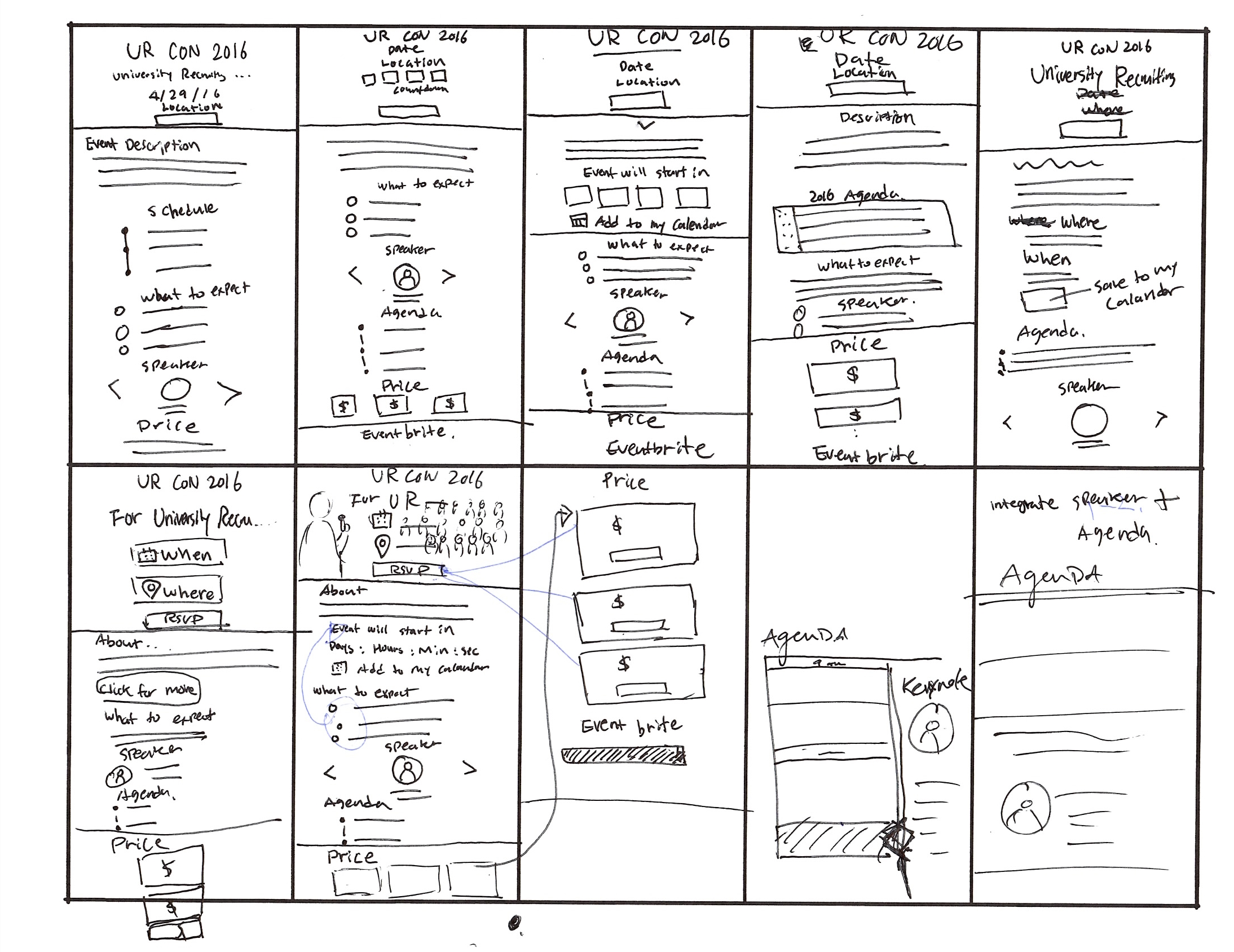
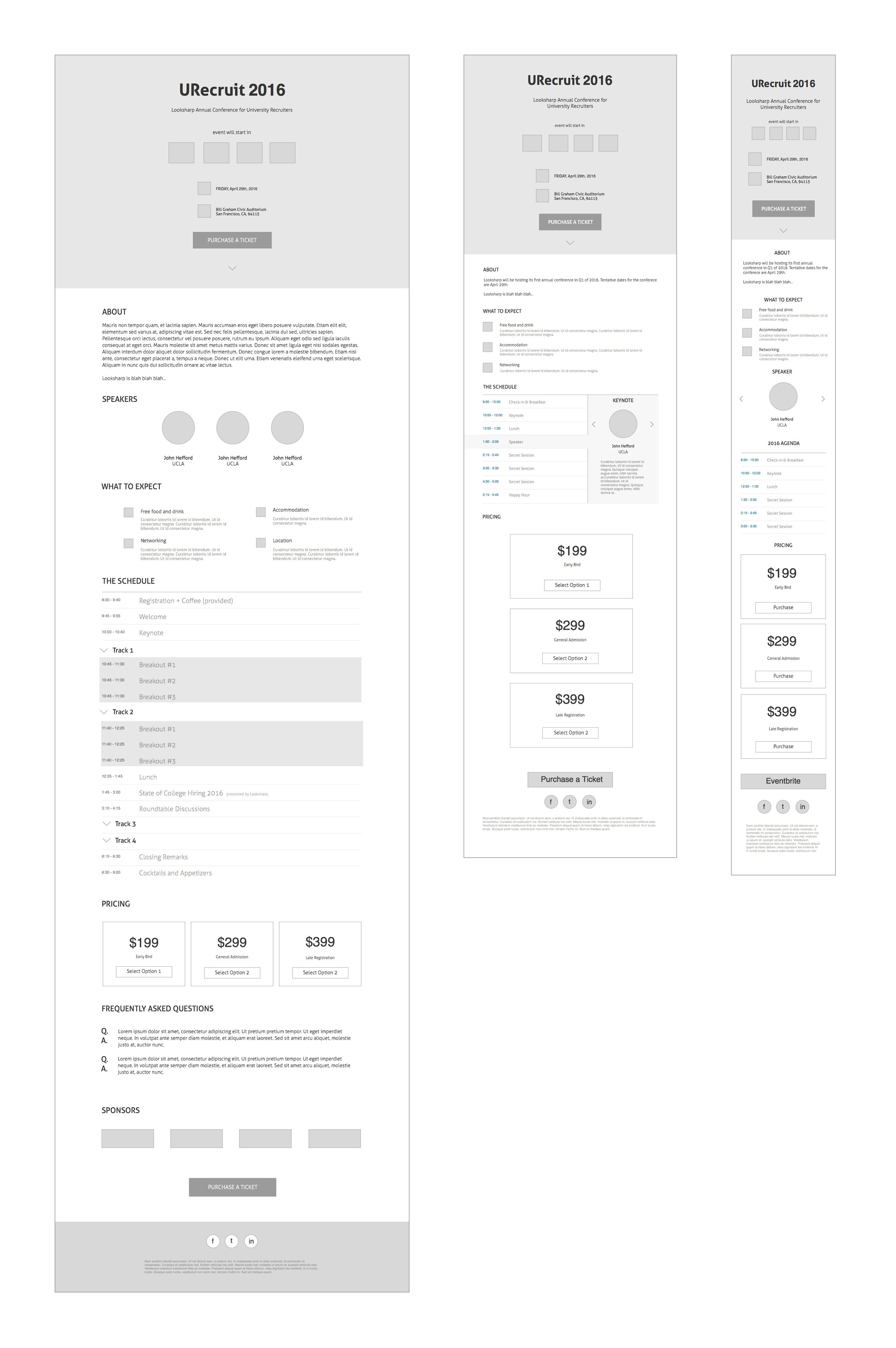
Sketches and Wireframes
User Experience process including defining problems, research, sketches and wireframes

The Design
I first began by putting myself in user's shoes and understand what is the hierarchy of information they need in order to attend the conference. The first thing that the user wants to see when they enter the landing page is where to find the description, location, date, and a link to purchase tickets. The second would be understanding what to expect, a list of speakers, event schedule and accommodation recommendations. The decision making process became painless when I understood the needs and questions the users are trying to answer.