
Earthling Foods
- Role
- Head of Design
- Timeline
- 2023 – Present
- Deliverables
- Logo, characters, packaging, website, apparel
- Related public release
- earthlingfoods.ca
Overview
Earthling Foods is a Canadian bakery that started during the COVID lockdown, when two siblings began hand delivering pastries to their neighbors. It has since grown into a family run, women owned business selling protein granola, protein cake cups, and the Dacaron, its signature macaron, all made in small batches without seed oils or artificial ingredients.
I was the head of design and built the brand from scratch. That covered the logo system and wordmark, the astronaut and Dacaron characters, the color palette and typography, packaging across every product line, the website, and the apparel and booth graphics the team uses at markets and trade shows.
The idea was to lean into the name. A retro space theme let a health focused brand feel playful and warm instead of clinical, which is the tone most better-for-you food brands miss.
Logo and identity
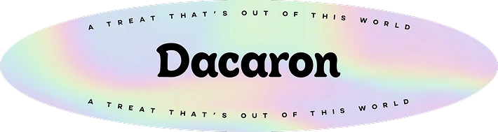
A soft, rounded wordmark paired with an astronaut mark, plus a badge lockup for the Dacaron sub-brand.
Characters
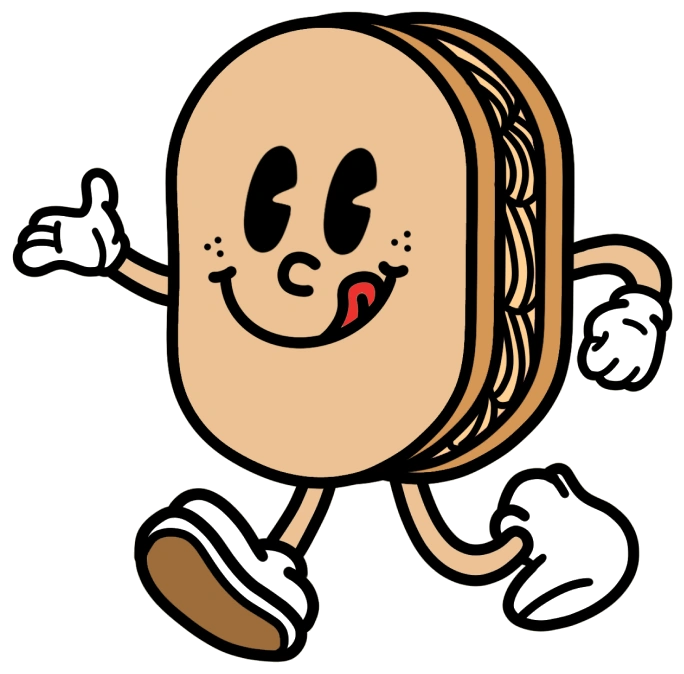
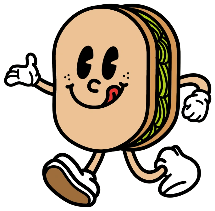
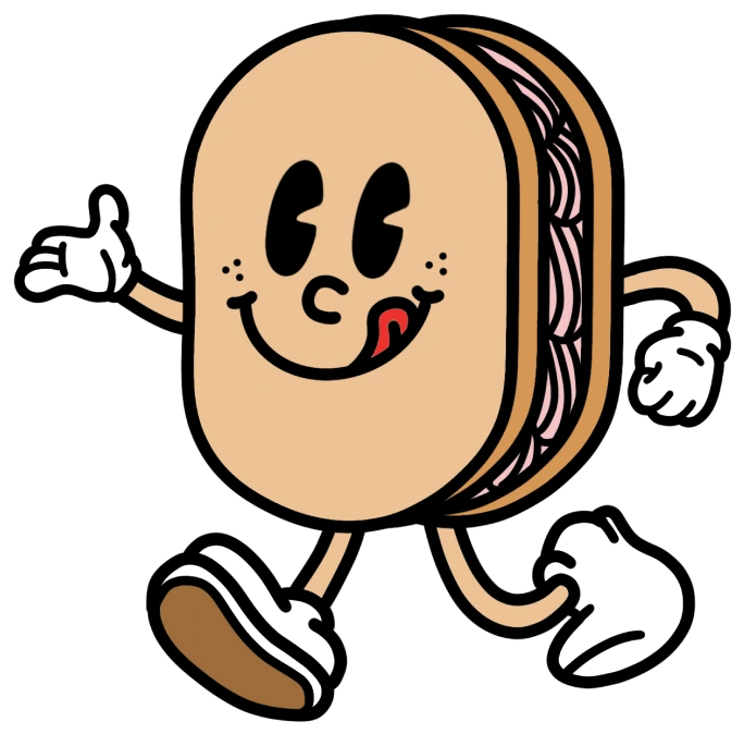
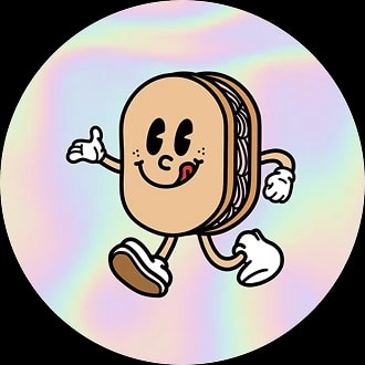
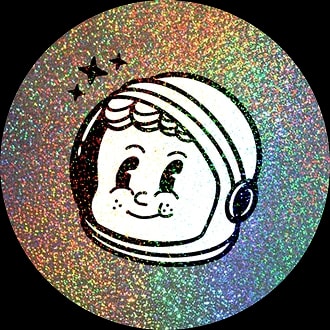
Two characters carry the space theme: an astronaut for the parent brand and a walking Dacaron for the product line. Both were drawn to work as small marks on packaging and as large graphics on apparel.
Color and type
Four colors and a single typeface keep the range coherent as it grows: a warm red for the brand, biscuit and meringue for packaging backgrounds, and a deep blueberry for contrast.
Packaging
The system had to stretch across very different formats: stand-up pouches for granola, clear cups for cake, and printed cartons for pudding, each with its own flavor coding while still reading as one brand on a shelf.
Website
I designed the site to feel like a bakery rather than a supplement brand, since the products are desserts first and the protein is a bonus. It opens on a full-width hero of the product, then moves through best sellers and the cake cup line before getting to the ingredient claims and the family story.
Brand in the wild
Beyond packaging, I designed the shirts the team wears at markets, the banners and backdrop for their trade show booth, and the graphics they post on social.