
PlayStation Communities
- Role
- Visual & Interaction Designer
- Timeline
- 2015 – 2017
- Collaborators
- PMs, Engineers, UX Researcher, UX Writer, Data Scientist
- Platforms
- PS4 console (TV), iOS, Android, web
By the numbers
- —Labels shipped across PS4 console, the PlayStation App (iOS/Android), and web
- —8-tab, 25+ notification-type system unified into one architecture
Overview
PlayStation Community let players find and join groups around the games they love, and I led visual and interaction design across the PS4 console, the PlayStation App on iOS and Android, and the web.
Most of my time went to Labels, a tagging system that lets a Community describe what it is about and helps players find groups that match how they actually play. Other social platforms already did something similar, using short tags to signal what makes a group distinct and to power search and recommendations. We brought that idea to Community.
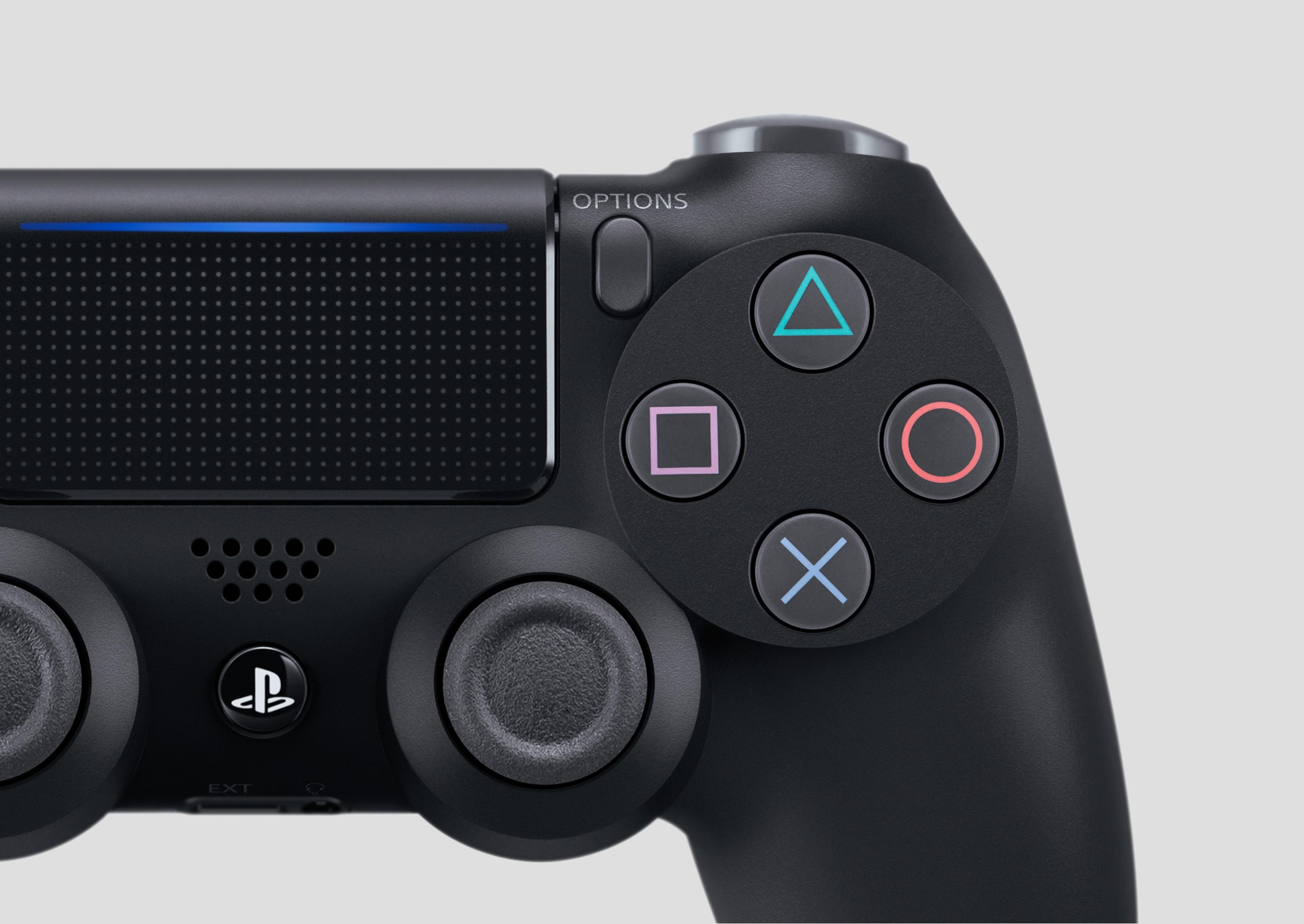
Console design is also 10-foot design: controller-first focus management, remote-input navigation, and a visual hierarchy built for the couch across every Community browsing surface.
The problem
Even with plenty of Communities to choose from, players had a hard time finding the right one to join. The differences between similar groups were not obvious. Some players wanted to start or join a Community but found several near-identical ones that already existed or were full, and lost the motivation to act.
Research pointed to a deeper habit: our core players do not like to actively search, and would rather come across relevant content as they browse. At the time, about 68% of Community members still joined no more than two Communities.
Goal
Give each Community a clear identity built around gameplay preference, and help players quickly find the exact group they want to play with. Labels would also make Communities easier to search and join, which we expected to lift engagement across the feature.
Four objectives guided the work:
- 1Prioritize: Understand which types of content would benefit most from Labels.
- 2Explore interactions: Try several ways to browse and select Labels.
- 3Unify the pattern: Map every surface that would display Labels and define one consistent pattern.
- 4Ground it in research: Use existing research to find the best way to introduce the feature.
Explorations
I explored a range of interaction models for browsing and selecting Labels, from single-screen pickers to multi-step flows, and tested each against the existing Create, Edit, and Search flows they would touch.
Research and requirements
Synthesizing the research and the flows Labels would touch gave us a clear set of requirements to design against.
- 1Grouped Labels: Multiple Labels, separated by category.
- 2Clear limits: A defined cap on how many Labels can be selected.
- 3Preview: A way to see a summary of everything selected.
- 4Search: A pattern for using Labels as part of Search.
- 5Clear all: An easy way to reset the whole selection.
The pattern also had to work fluidly across multiple flows, scale to a large number of Labels and categories, and stay simple enough to understand at a glance. At launch, Labels would appear in Community create and edit, Community search, and the rich profile.
User testing
In the first round of usability testing, players responded well to a “Your Labels” area that summarized everything they had selected, which let us drop the separate preview screen. We also saw that many players assumed they could write their own custom Labels, which the system did not support, so I made the fixed set clearer in the selection flow.
Final design
The final design applied one consistent Labels pattern across Community creation, search, and profiles, with a “Your Labels” summary and a simple way to clear everything at once.
Selecting labels
One picker, on brand
Players browse labels by category, watch their selections build up, and review everything in a single “Your Labels” view before confirming.
In context
Labels where players actually see them
The same labels carry through to the surfaces players browse, from the Community profile to a player's Rich Profile.
Other features in Community
Alongside Labels, I designed other parts of the Community experience across console, mobile, and web, from entry points and the console app introduction to event and link sharing and shared components.
Impact
Labels shipped as part of a cohesive Community experience for millions of players across console, mobile, and web. On the PlayStation App, I also owned interaction design for Notifications, Settings, and the app boot sequence, simplifying a fragmented eight-tab, 25+ notification-type system into a unified architecture informed by usage data.