
Files by Google
- Role
- Lead UX Designer
- Timeline
- 2018 – 2022
- Collaborators
- PM, 8+ Engineers, UX Researcher, Content Designer
- Related public release
- Files by Google
By the numbers
- —16M monthly active users on the Trash folder
- —Addressed 25%+ of Play Store reviews, the top requested feature
- —Targeted a 90% cut in deletion complaints (25% to under 3%)
- —Visual tooltip pattern later adopted by other Google teams
Overview
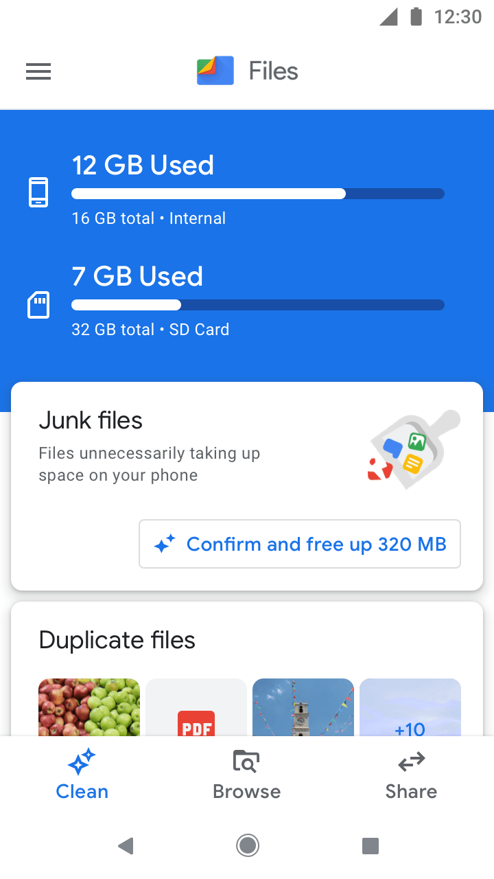
Files by Google is the file management app for the Next Billion Users, built for low-end devices and storage-constrained phones. A common problem for these users is losing files to accidental deletion. More than 25% of Play Store reviews asked for a way to restore deleted content, by far the most requested feature, with complaints like “I want to restore deleted photos” and “I need a recycle bin or I delete this app.”
As the only lead UX designer on Files, working with one PM and one engineer, I led Trash end to end.
The problem
The existing flow let people delete files permanently in one step. For less tech-savvy users and new internet users, the blue “Delete” button could easily read as “continue,” and not everyone reads the dialog text before tapping.
People already expected a Trash, because they knew it from Gmail, Drive, and Photos. As more apps adopted the platform-level Trash API in Android 11 and later, that expectation in a file manager was only growing.
The question
How might we make deleting feel safe without using up the storage people cannot spare?
The challenge
Adding Trash meant a complete overhaul of how deletion worked in Files. The hardest part was communicating the difference between moving a file to Trash and deleting it permanently, since trashing a file does not immediately free up storage. On top of that I had to onboard both existing and new users, design the low-storage states, and solve a long list of edge cases against a tight release cycle.
Goal
The goal was to build Trash as a safety net that prevents accidental deletions and reduces anxiety while adding real value to the app.
The target was measurable: cut deletion-related complaints from about 25% of all reports to under 3%, a 90% reduction, without growing low-storage users by more than about 2%.
Research
I grounded the design in field research across Mexico, India, and Nigeria. Participants already knew Trash from Google Photos and PC recycle bins and saw “Move to Trash” as a way to recover files after an accident. But when testing the wording, they understood “Move” literally without knowing where the files went, so I had to set a clear expectation that files stay recoverable for 30 days.
Between two directions, people preferred a bottom sheet with an immediate restore option over a confirmatory dialog, because it felt more intuitive in the everyday case.
The solution
I designed Trash end to end, from the moment someone deletes a file to the point where a full Trash starts eating into their storage. Here is how each part came together.
Discovery moments
A bottom sheet at the moment of deletion
Testing showed people read “Move” literally without knowing where their files went, so the first job was setting expectations right where they delete. Moving files now opens a bottom sheet with an animated illustration and a short hint that the file stays recoverable for 30 days.
Two tooltips to reinforce it
Version 1 introduces the feature to people who already had the app, explaining that files in Trash stay on the device and can be restored for up to 30 days. Version 2 is lighter and appears once files have been moved, pointing to where they went.
Both sit on the hamburger menu across Clean and Browse, the two places people delete from, and each shows only once so the education never becomes noise.
Entry point
One place to find Trash
Trash sits in the hamburger menu with the rest of the app's destinations, and it always shows how much space it is holding. Surfacing that number mattered, because trashed files still count against storage, and hiding that would break trust on a device that is already tight on space.
Trash folder
The folder itself
The Trash folder mirrors the Clean review screen, so it already feels familiar. Restore and Delete are the two primary actions along the bottom, and both stay disabled until something is selected. Files are grouped by how many days they have left, and a banner up top reminds people that anything sitting in Trash for 30 days is permanently deleted.
Deleting permanently
Permanent deletion is the one destructive action here, so it gets extra friction and a distinct color. Tapping Delete brings up a confirmation that spells out the action is permanent and cannot be undone, with a red button rather than the usual blue, so it can never be mistaken for moving to Trash. Once files clear, a short celebration screen confirms how much space was freed.
Restoring files
Restoring is the safe, everyday action, so it stays light. Selecting a file and tapping Restore opens a simple bottom sheet confirming the file will go back to its original location, and it returns to the Trash list marked as restored. No dialogs, no warnings, since nothing is being lost.
Empty state
When there is nothing in Trash, the folder does more than sit blank. It uses the moment to teach, with an illustration and a line explaining that files moved here show up in this place and clear automatically after 30 days.
Low on storage
Surfacing Trash when space runs out
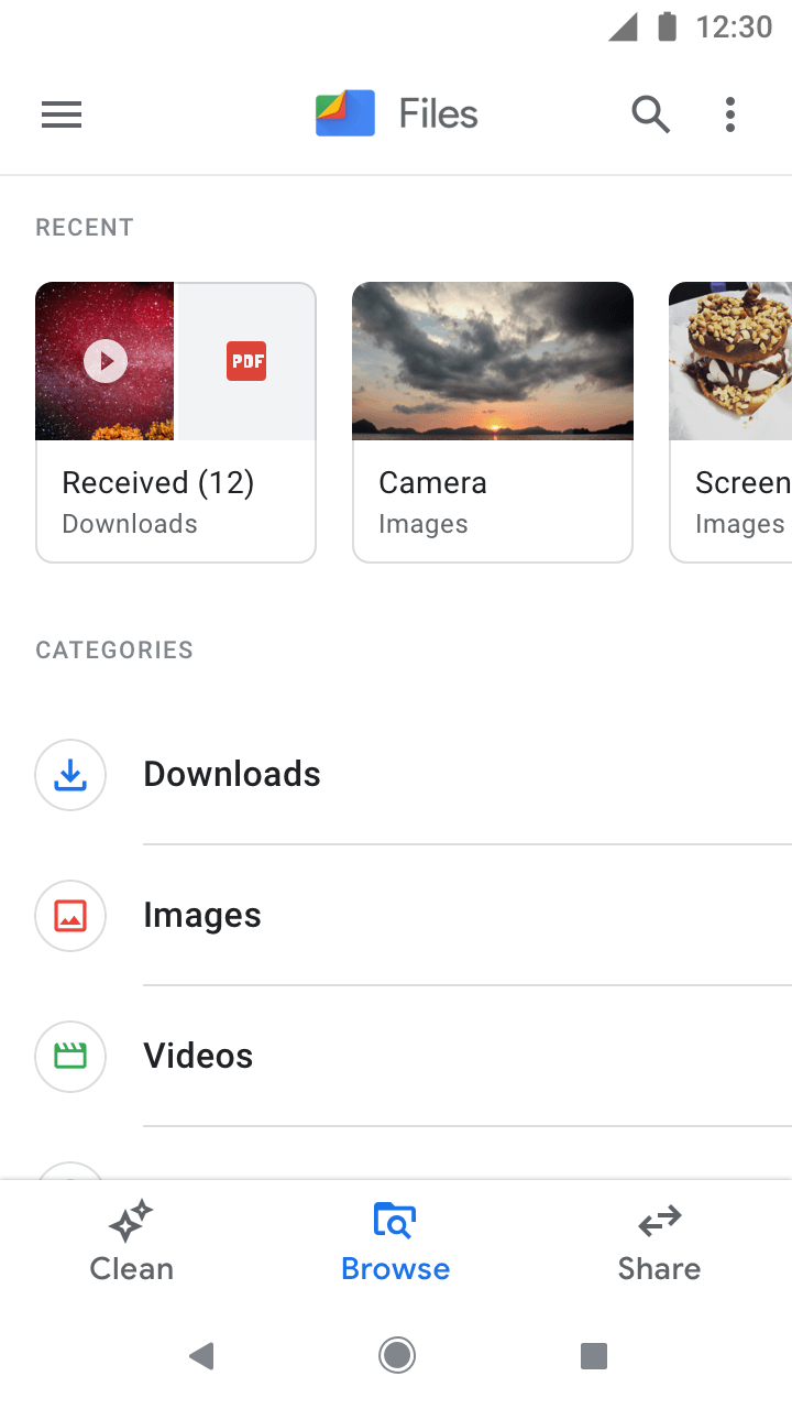
Because trashed files still take up room, Trash had to become visible exactly when storage got tight. In Browse, a persistent banner stays until space is freed, and a mini bar appears right after files are moved. In Clean, a “Go to Trash” button sits in the storage section, with the storage bar pinned to the top as people scroll.
Under 500MB the device is critically low, so the mini bar and the amount sitting in Trash turn red to signal urgency. A system notification covers the case where someone is not in the app at all.
Outcome
Trash reached 16M monthly active users, with 27% permanently deleting from it and 6% restoring files. I led the feature end to end, a highly complex one that touched most of the Files experience and balanced Android platform constraints, technical limits, and user needs. The work also introduced a new visual tooltip pattern that other teams went on to adopt.